Using neutrals

Yesterday three students and I enjoyed a session together exploring the power of neutrals. These subtle tones are often neglected by the new pastelist seduced by the jewel-bright intensity of pastels, but they are critical to the success of paintings that aspire to be naturalistic. Nature is sparing with her intense hues, and when we paint with only these, the results can be garish and very unnatural. Neutrals are of great use when utilizing the visual principle of "simultaneous contrast" to direct your viewer's eye through your painting.  This principle, at bottom, tells us that things are influenced by their contexts.  In other words, our perception of a colour's hue, value, temperature, and intensity are all affected by what surrounds it.  There are startling examples in art books where the very same colour looks entirely different because it is surrounded by different colours. For example, a "cool" blue can look warm if surrounded by even cooler greens, or a "warm" scarlet can look cool if surrounded by even hotter oranges. In the same way, a bright colour shouts even louder when surrounded by grayed, subdued tones. You can use these effects to emphasize your focal point and de-emphasize less important areas of your painting. These tones are the quiet cousins of your palette box, and as such are easy to overlook.  Richard McKinley suggests organizing them in a separate section of your pastel box, where their subtle beauty and quiet appeal will be more apparent, rather than leaving them to fight it out in the company of the more brilliant hues.

To understand this concept, first we examined photos that revealed the power of neutrals to provide a foil for notes of bold colour.  Several photo spreads in the November 2011  issue of National Geographic provided perfect examples: one shows a woman wearing a red headscarf striding through a burnt-out forest in Uganda; the other features a spray of crimson maple leaves on a rock in the midst of a cold scene of a rushing river in late fall. In both cases, the small notes of red leaped off the page and riveted the eye. We also looked at a variety of paintings in art books that illustrated the same idea, even critiquing one in which two notes of red-orange in an otherwise gray-toned painting bounced the viewer's eye between the two extreme edges and destroyed the concept of the work!

We each chose scenes in which we could use the neutrals in the majority of the work, adding a contrastingly intense hue in the area of our focal point. The choices included a snowy field in winter, lit by a splash of warm sunlight on remaining corn stubble in one area only; a shaded green field in midsummer, with a streak of bright green light slipping behind the trees in the foreground and lighting up a slice of the field; a subtle, foggy scene to which the artist added a note of lime green to indicate a momentary ray of light on a distant meadow; and my choice, a photo I had taken just that morning, of the frost on the marsh behind my house, kissed by the first ray of the rising sun. Here's the resulting painting, though it seemed to be impossible to render the correct colours digitally (the actual painting has much less intensity in the orange tress, so the focus is more on the light on the marshes!):

It was a challenging lesson, but all the paintings turned out very well, and it's a concept that is a very useful tool in the painter's toolkit.

What's Wrong with this Picture?

I'm talking about a painting that just...doesn't...quite...work!  And what you might try to get yourself out of the problem.  

Take this perfectly "ok" painting I did last weekend during an open studio session.  It's ok but not stellar--a bit boring, a bit flat. I like the field of goldenrod and the willow on the left, but something's just not quite right about it.

First, I tried changing the angle of the pathway, adding a bit of shadow under the willow, expanding the group of yellow birches in the background, and experimenting with a different composition by cropping with a piece of paper clipped to one side.  Maybe--it's better but still doesn't thrill me...


Figuring there was nothing to lose at this point, I tried spraying the work fairly heavily with fixative. First I spritzed with Spectra-Fix ( a casein-based product) but the pump sprayer head jammed and splattered a heavy coat in one area--ack!  So in desperation I grabbed a can of Krylon fixative and sprayed the heck out of the whole thing.  As a result, the painting was MUCH darker and the surface looked quite "plastic", but the "tooth" of the surface was restored.  Interesting...now what?


Going back in with the pastels, I restored interest and texture to the goldenrod field, extended the shadow of the willow, and decided the rectangular format worked best after all (good thing I didn't actually chop the edge off!).  It's still not the best thing I've ever painted, but I like the piece much better now, so next time you have a failure or a near-miss, take some risks, keep trying various things, and see where it takes you--after all, it's just a piece of paper!


The demo: how I paint

Although I have been teaching pastels for about three years, and have more than thirty years of teaching experience, the thought of completing a complete demo for my students was still daunting! I wasn't sure I could articulate what I was doing and why I was doing it ( a "left brain" analytical kind of task) at the same time as actually painting (definitely right brain!).  However, my students had asked, saying they felt they learned a lot by simply watching me, so I took a deep breath and agreed. In the weeks up to the demo date, I tried to think clearly about what I actually DO as I'm preparing to paint.  It may look as if I simply dive right in, but in fact a great deal of thought goes on behind the scenes before the pastel touches the paper.  So, I developed a step-by-step talk to precede the actual demonstration of painting.

First, I scrolled through a file of photos taken this summer, and talked about how I carry a camera in my car at all times, and constantly watch for promising scenes and light effects as I'm driving anywhere at all.  I am fortunate to live in the country, and my daily commute takes me through lovely rural landscapes, across streams, and beside marshes and lake edges.  My summer photos include myriad such scenes, snapped at all times of the day, but especially in early or late light, when the raking sun creates dramatic values and saturated colours.  I showed the students how I frame the possible scene in many different ways, turning the camera horizontally and then vertically, zooming in and out, stepping right and left.  An eventual painting may be any one of these shots, or a combination of several.


Then, I showed them how I play an on-screen slide show of a file of photos, while I stand across the room watching for a composition or light effect that jumps out at me.  Once I have several to consider, I start playing with the scenes in iphoto or photoshop.  I try various crops to experiment with placement of the focal point and various formats (rectangle? oblong? square? vertical?); saturating colours more to see what would happen if I pushed them one way or another (cooler? warmer? brighter? moodier?); changing the exposure to try increasing or decreasing the contrast; and, finally, I look at the scene in black & white or grayscale to assess the value range in the piece. Eventually one composition will be the winner, and I'll create a version with the desired cropping, saturation, and value scale.


I might also do two thumbnail sketches in ballpoint pen--one of the value pattern, looking for a pattern that is either mostly light with a smaller pattern of linked darks, or the opposite (mostly dark with a smaller linked pattern of lights), and one of the major shapes outlined by simple lines, to check that I have big shapes, middle sized shapes, and small shapes for variety and interest. I'll check that primary and secondary points of interest are falling near intersections of lines dividing my planned paper shape into thirds. As well, I spend a few moments thinking clearly about WHY I am choosing to paint this particular scene.  Often, I'll choose a title that encapsulates whatever that concept is--is it something about the light, the season, the place, the mood? If I am clear about what the concept is, I'm more likely to make decisions throughout the painting process that enhance the idea rather than obscuring or diluting it.

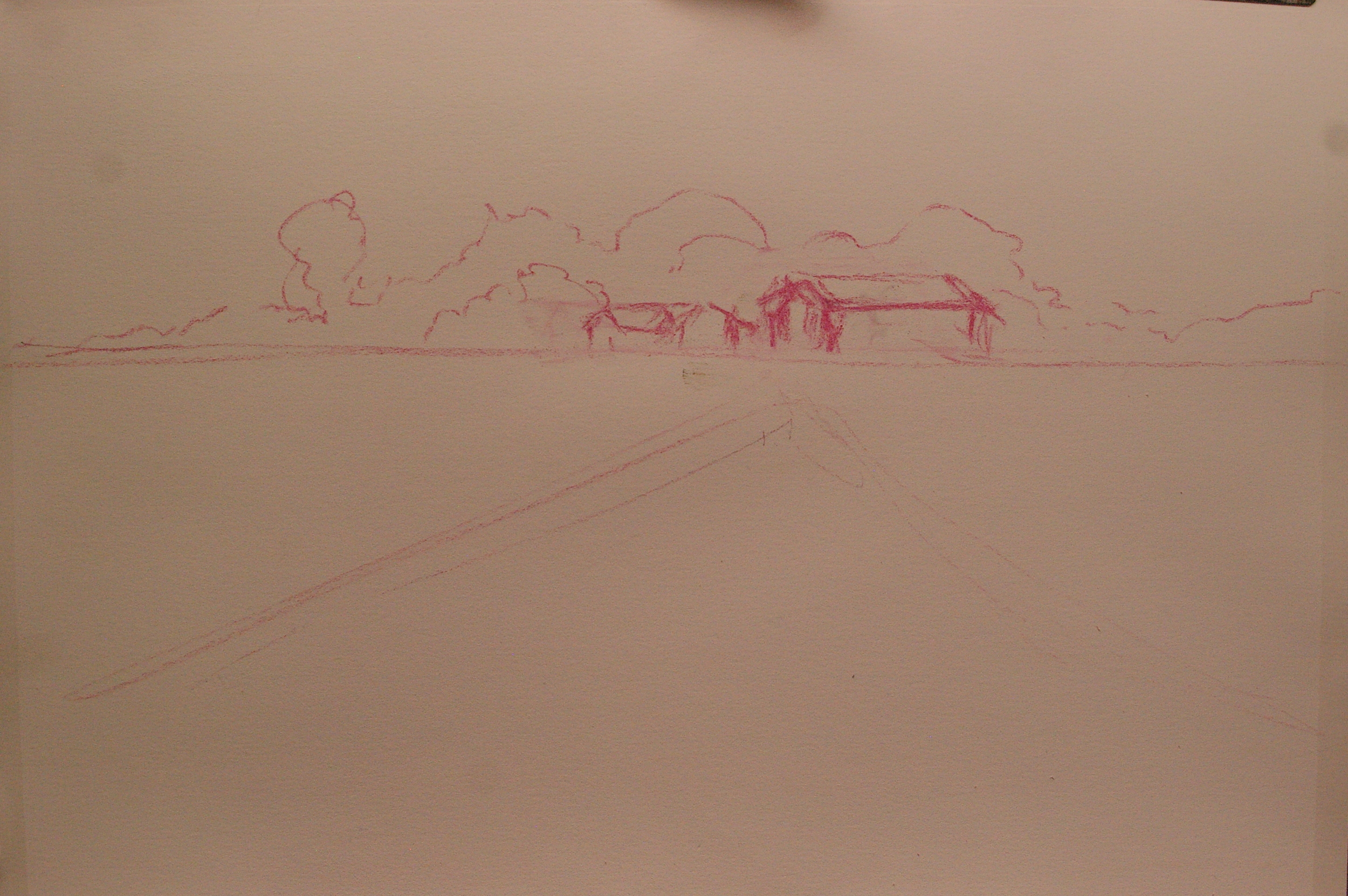
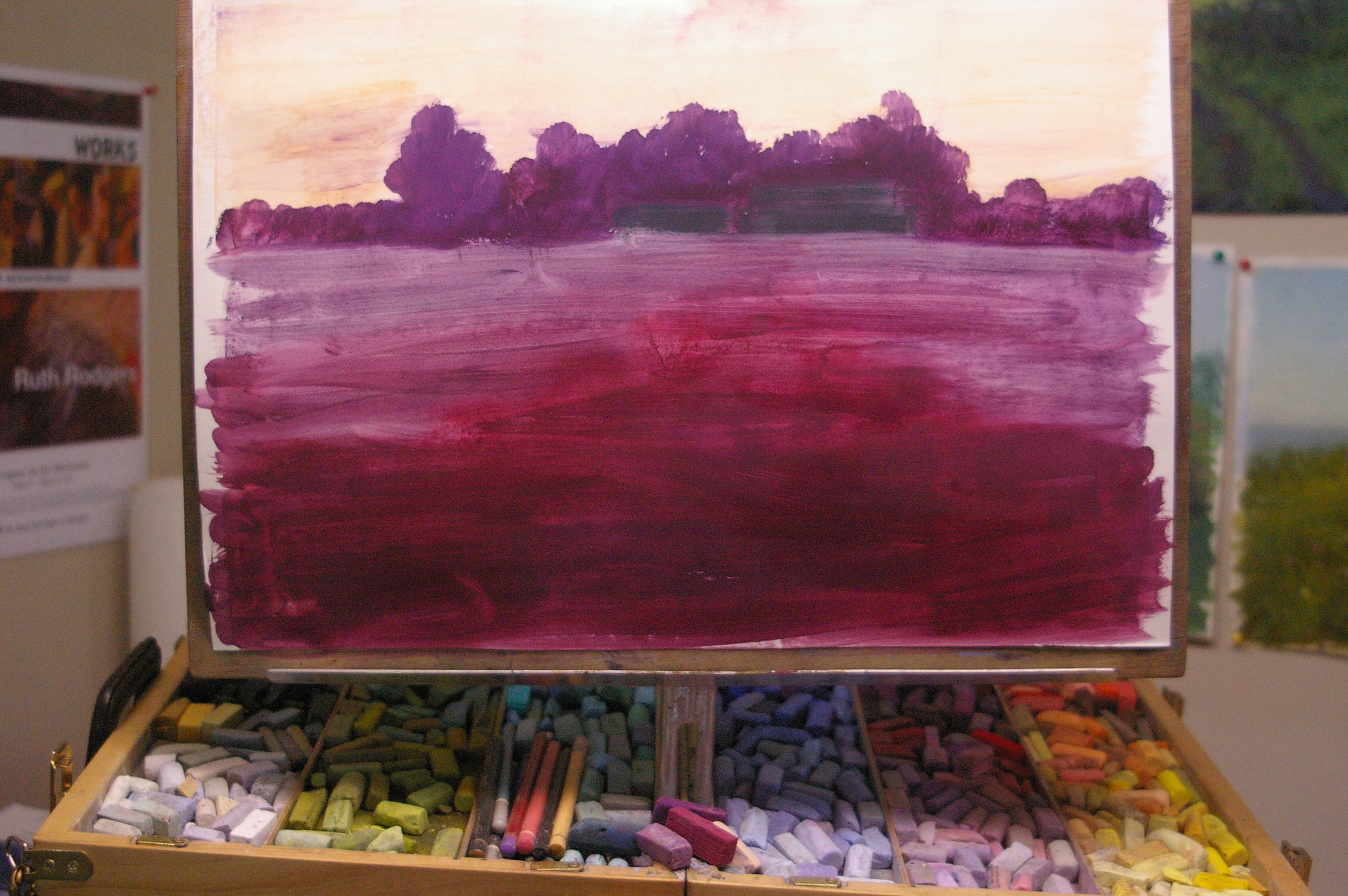
NOW, it's finally time to cut the piece of pastel paper and clip it to my board. With the final slide on my nearby computer screen, I sketch in the main shapes with a pastel pencil.  Then comes the pastel underpainting, an alcohol wash, and the actual painting.  I've detailed these steps in earlier posts, so I won't describe them here, but during the demo I tried to explain not only what I was doing, but why I was doing it. My rhythm is to paint until I feel myself slowing down because I'm not sure what to do next...at that point, I step back, switch from right to left brain (from intuitive to analytical) and examine what needs to happen next.  Typically, the minute I step back, the next step is abundantly clear, as in "Yikes, that tree looks like a huge lump; I need some sky holes and to vary the edges more!" It was fun to see if the students agreed about what needed to happen next--after awhile, we were almost painting by committee! The main focal point tree, which I had underpainted in purples and oranges, intending it to be a late summer green, ended up being an early fall orange, which shifted the focus of the whole painting.  That was part of the lesson, of course--to stay alert to what is working in a painting, and let it speak to you along the way. In the same way, the cornfield became an amorphous "field of yellow"--grain? sunflowers?  it didn't matter, it just needed to be less identifiable, softer and less obtrusive in order to provide a stage for the main players (the tree and the reflection in the stream).

Once I got started, it was fun--my nerves settled and my confidence returned.  After the students left, I did some fine-tuning and corrected a logic problem in the reflection (it wasn't actually reflecting anything in the landscape above it!). I think the final painting, Summer's End (as named by Audrey) is quite successful, and I do believe the demo was worthwhile for the students.  Whew!

However, my students' satisfaction COULD have been because they got the chance to cuddle the studio kittens throughout the demo! :)


Orange you glad it's not ALL green? (summer greens part 2)

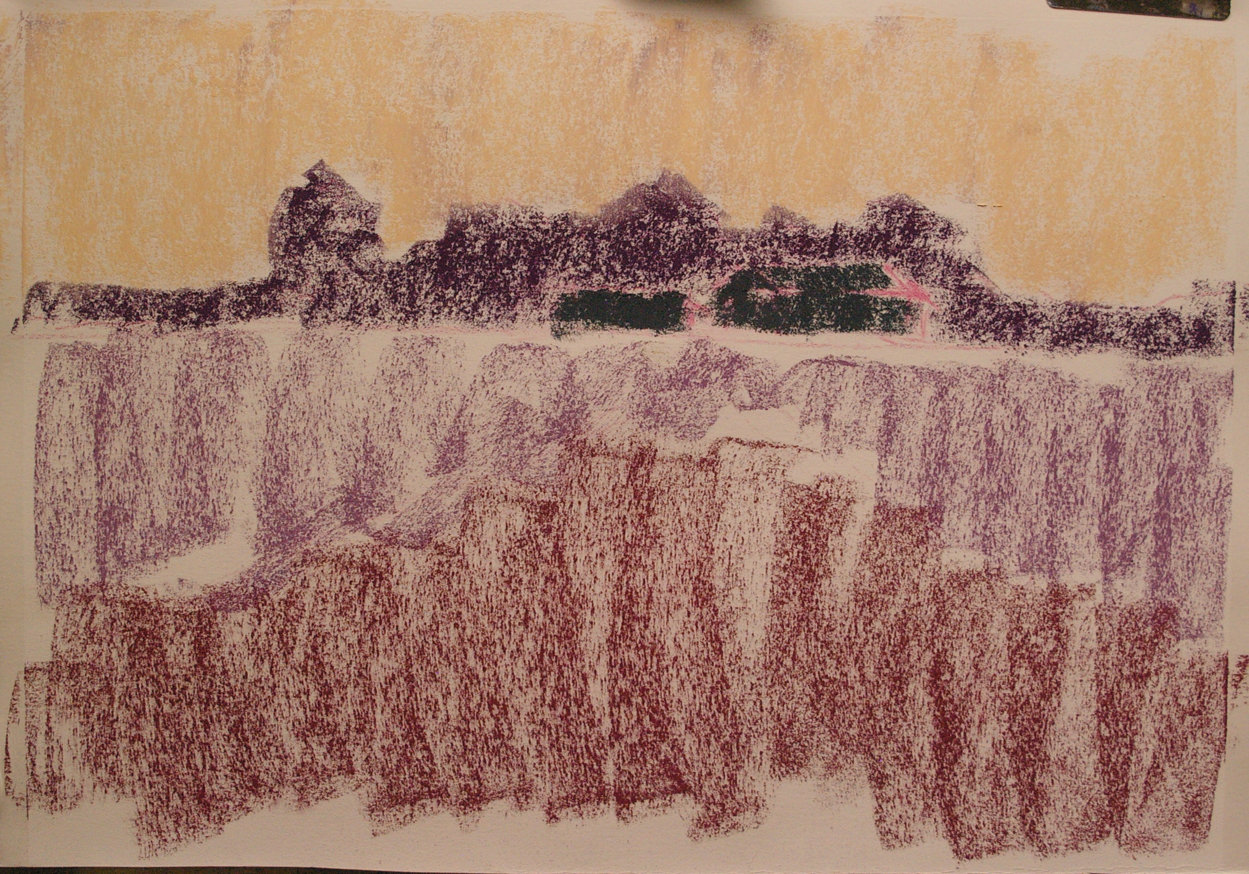
As the summer progresses, grasses start to take on a warmer tone, and late summer paintings benefit from underpaintings in orange and purple.  I recently completed this one, titled 'Til the Cows Come Home, by underpainting entirely with tones of orange (pale peach under the sky, pure orange under the grasses, and deep orange under the trees) and a red violet under the shadow areas.  You can still see the underpainting quite clearly in the detail shots, tying together all the varied greens in the scene.  


Summer Greens

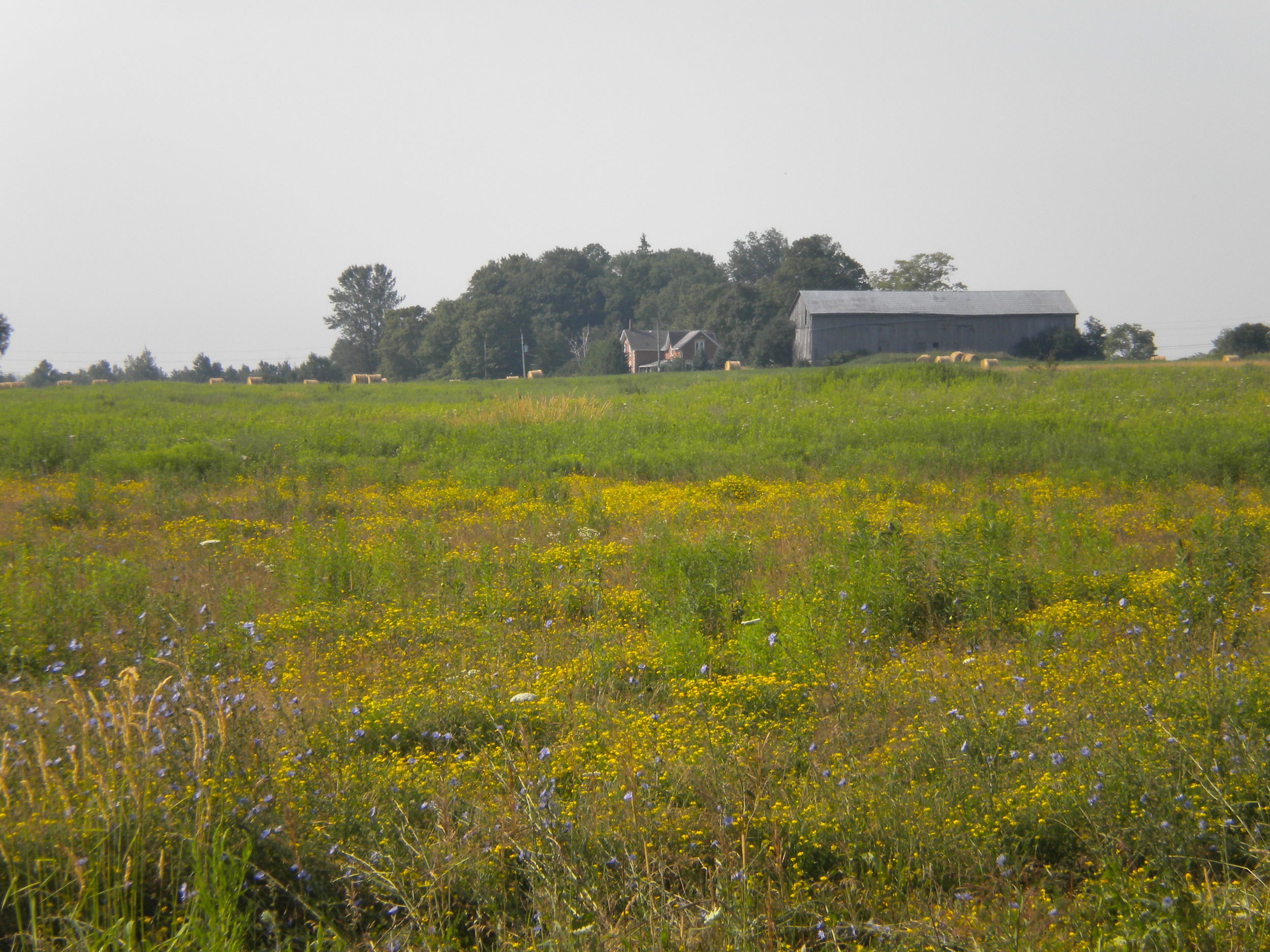
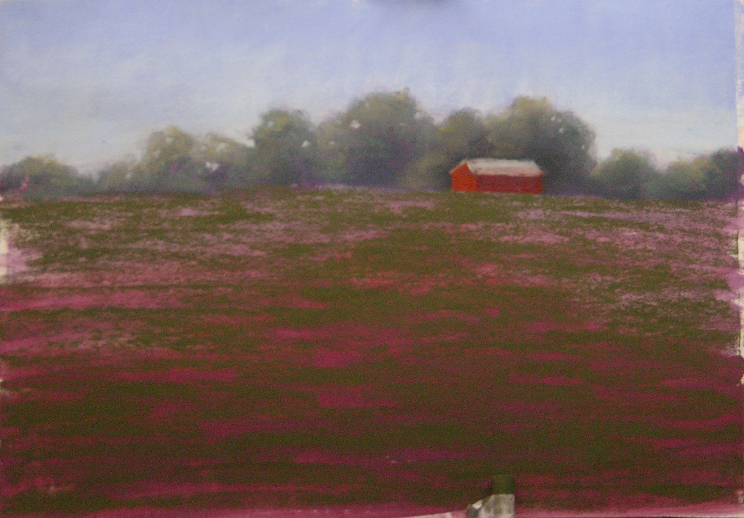
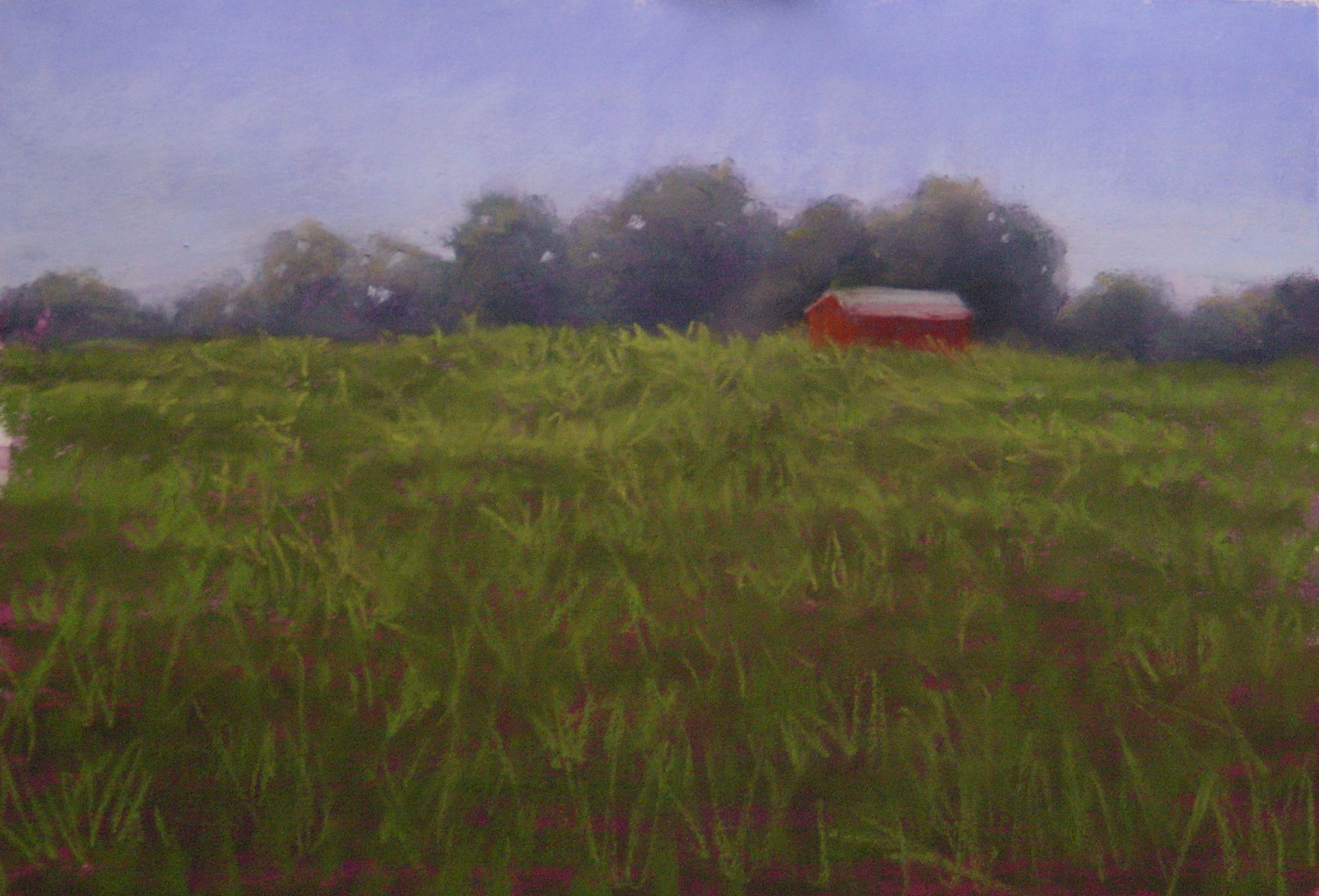
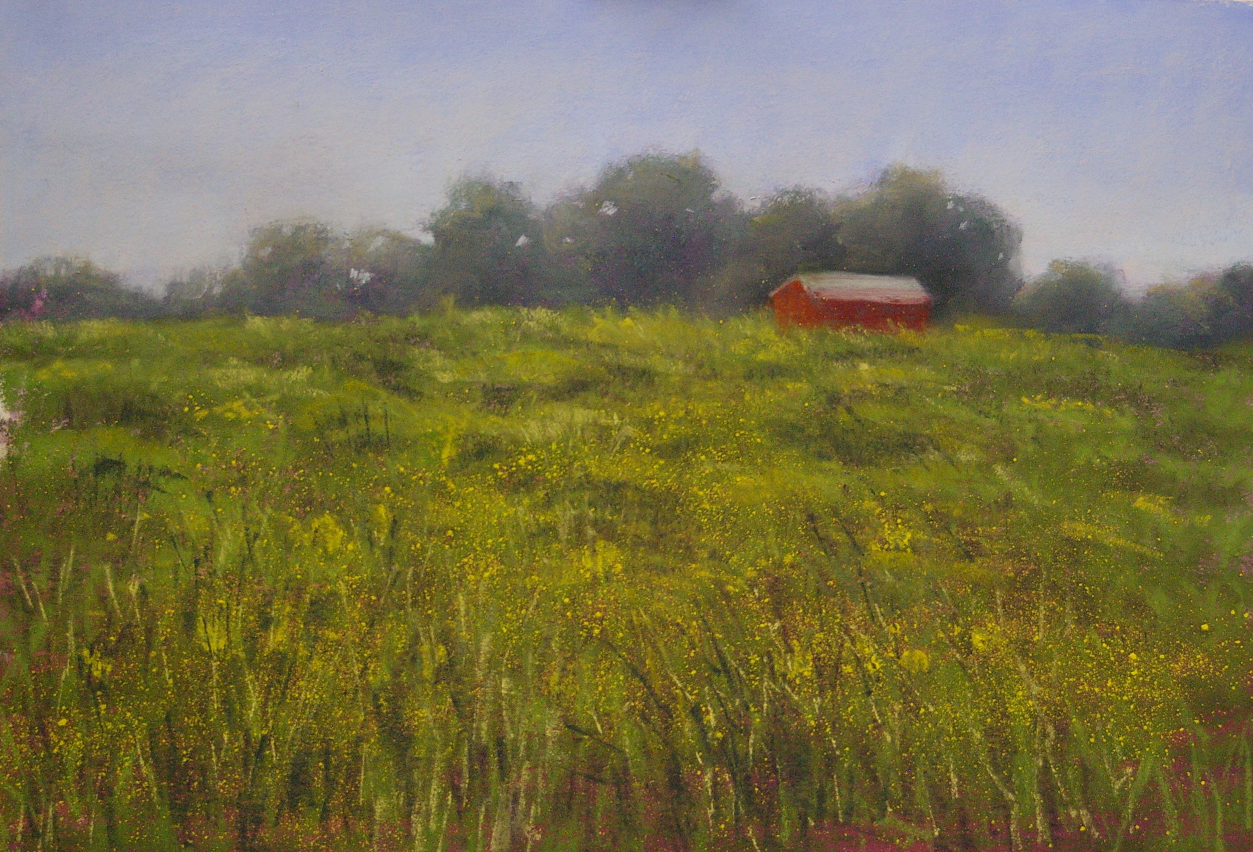
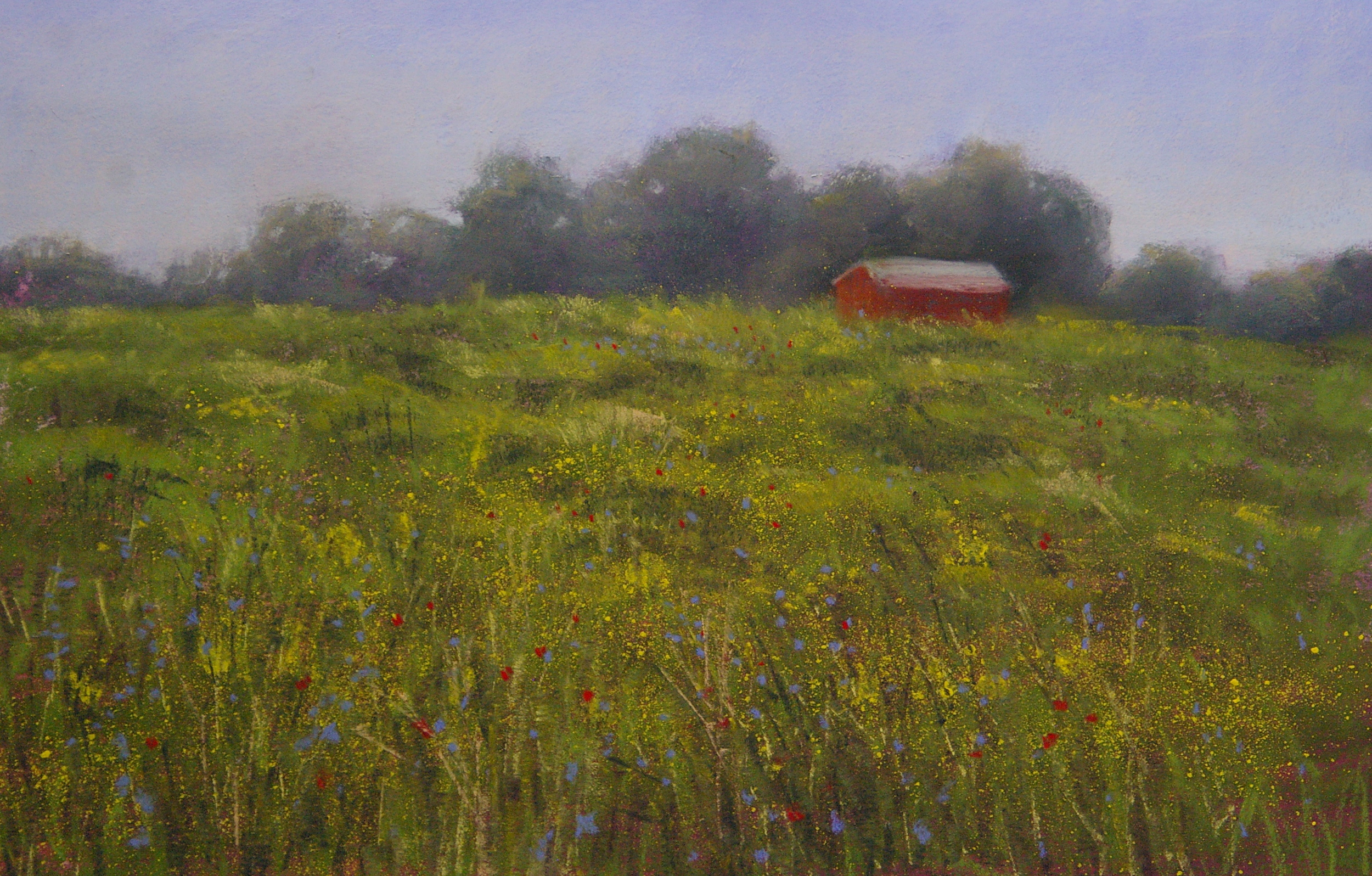
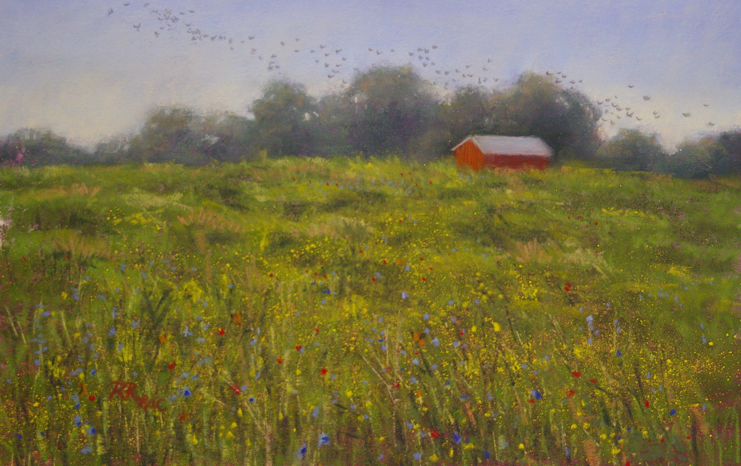
One of the toughest problems painters face in the summer months is the challenge of GREEN. Sometimes it seems as if the whole world is a sea of green, as in Paul Simon's song Kodachrome, "Give me the greens of summer; makes me think all the world's a sunny day." An upcoming lesson in my studio will (I hope) help students to tackle the challenges of "too much green" successfully.  Here are the steps in a demo that I've prepared to support the lesson, based on a photo taken of the summer field behind my friend Sandy's house.


For the scattered yellow flowers, I tried a new technique: I crushed a small amount of a vibrant yellow pastel into a dish, dissolved it in a bit of rubbing alcohol, then dipped an old toothbrush in and spattered the field.  Despite a few too-large drops, I was happy with the overall result, and once it dried it was easy to fix the areas I didn't like.  It looks more natural than hand-dotted flowers, I think.


The flock of starlings was inspired both by a flock that flew chattering by my studio as I was working, and my desire to have a balancing diagonal in the opposite direction to the main flow of the eye-path through the painting (essentially bottom left up to the barn in the upper right).  Using a dark gray pastel pencil, I started adding in the universal symbol for " flying bird": tiny v-shapes.  I kept adding, stepping back to check, adding more, smudging a few out...until I had a natural-looking flock.  I signed the piece in the bottom left (unusually for me), in red, to add another note of balance to the red barn, and named it Summer Flock.