Waving Hello and "Goodbye"

While at the International Association of Pastel Societies (IAPS) conference in Albuquerque N.M. in early June, I attended a wonderful hands-on workshop taught by Jeanne Rosier Smith ( http://www.jeannesmithart.com/gallery5.htm), an artist whom I have admired for some time for her fresh, evocative paintings of waves. I was delighted to discover that Jeanne is also an articulate and skilled instructor, and even more pleased to find that, following her demo and directions, I was able to create two lovely pastels of waves myself, this being my first one... IMGP7670

Ever since, I've become obsessed with painting waves in both pastel and acrylic, and am now in the process of trying one in "thread painting" (a technique similar to quilting that substitutes finely cut textiles for paint).  In fact, I've decided to focus my fall solo show at the Gibsons Public Art Gallery (opening Oct 15, 2015) on depictions of water, including lots of waves. Some of them can already be seen at The Landing Gallery in Gibsons Landing, B.C.

Here are some samples so far:

IMGP7665 IMGP7668 IMGP7671 IMGP7673 IMGP7675 IMGP7678 IMGP7680 IMGP7682 IMGP7685

On another note, I will soon be moving my website to another platform. The address will stay the same, but the hope is that it will be cleaner, easier to navigate and manage, and, of course, more attractive!  I'll let you know when the move is coming--stay tuned.

Pastels in the Landing

Three of us enjoyed a wonderfully peaceful but productive time last weekend in the spacious and well-equipped Arts Building in Gibsons Landing. My students Camilla and Valerie each completed two beautiful works, and were indulgent with me as I did a couple of small paintings myself!  The sun shone, the breezes blew, and we were happily and fully engaged in the creative process--heaven! Thanks also to Lauren Hemnes for her administrative help, and Georgina Brandon for inviting me to teach in this location. Valerie painting towering clouds on day one.

Camilla hard at work on her very first pastel painting ever.

Sorting pastels onto the colour wheel to learn about hue, value, and temperature

Valerie and her beautiful rendition of Merry Island!

Camilla and an inviting shoreline scene!

Revisiting a painting

Sometimes you finish a painting and you are "okay" with it, but something just isn't...quite...right, but you can't figure out what it is that's bothering you.  Around the Bend (below) was one of those paintings. I did it just before last year's Art Crawl, framed it, and hung it on the gallery wall in the studio.  There it sat, garnering no attention, and as the months went by it irritated me more and more. What the heck was wrong with it? around the bend

Then, last week I visited an exhibition by west coast artist Renato Muccillo at the White Rock Art Gallery (http://renatomuccillo.com/home.html) . I was extremely impressed with the works, noting that the subject matter and compositions were similar to my own.  Although I don't aspire to the technical polish evident in Muccillo's pieces, I do think I can learn a lot from his approach. One of the differences I noted  was Muccillo's level of foreground detail, and I came home determined to take another look at my own paintings with this in mind. As a result, I completed The Green Fuse, which includes much more fine detail up front than my usual work.

The Green Fuse 16 x 20 $650


As I was standing back and contemplating this piece as it neared completion, I happened to glimpse Around the Bend out of the corner of my eye and had a flash of insight...its foreground needed work!  Off the wall and onto the easel it came, and I started in on the foreground details.

And then my husband came in and commented that the perspective on the grass heights was off, so I fixed that.  And then I realized that the focal point was being divided by the presence of the TWO trees (even though the original scene had both trees, it just wasn't working), so down came the evergreen...which then allowed me to notice that the remaining tree needed re-shaping and adjustment of the values to make it more visible against the sky and background trees, using counterchange. (dark against the light sky/lighter against the dark trees behind it).

Ok, it was improving. Then I sat down with a cup of tea to judge my changes, and had the BIG realization.  At some point in the painting's evolution, I had changed the sky from a pale blue to a pale pink--and I had forgotten to change the water surface (reflecting the sky) to match!  Duh!!  Yup, THAT is what had been irritating me all along.  Can't believe I didn't catch the error in my usual final "logic check" (where I check things like angles of reflections, cast shadows etc.)!

So, I abandoned the tea and immediately repainted the water surface.  More noodling with the detail, more fixing of the grass levels. Final check revealed my usual crooked horizon (I often drop slightly as I go from left to right, and have learned to use a T-square to check, as I don't trust my eye).  Ok, fixed that..and I think I am finally satisfied! But the painting has changed so much that it needs a new name: presenting Rosy Dawn. I won't be grieving the loss of Around the Bend, as that painting nearly drove me there!  In the end, however, it was a good lesson. Given enough time, I eventually figure out what the problems are--good idea to give "near-misses" an aging period!

Rosy Dawn 20 x 16 $650

On the Beach: a commissioned painting

Late last summer I was asked to take on a commission painting by a patron who had admired my recent paintings of beach scenes. She requested that I undertake a double figure portrait of her two granddaughters in acrylic. We discussed the approach and style, agreeing that an informal setting such as the beach, and an impressionistic style, would suit both the patron and the subjects. The resulting painting was to be a Christmas gift to the patron's daughter (and her family), so obviously the children knew about it--but would not see the finished work until Christmas. As a result, I spent a very enjoyable hour a few weeks later photographing the young sisters as they interacted with each other and some props I had provided (buckets, umbrellas, beach towels etc.) in the small cove just below their grandparents' house. The sisters (10 and 8 in age) were utterly charming and obviously the best of friends. They interacted imaginatively and naturally with the props, and I just circled them, listening in, watching, and snapping away, as they played. None of the poses were "directed," as I wanted to observe how they related to each other without my intervention. One of the hardest things about commissioned portraits of people with whom you aren't familiar is capturing not only a likeness but the person's character. Long "from life" sessions were not an option here (the girls do not live locally), so I did my best to maximize my photo shoot and got about a hundred shots within the time frame we had available.

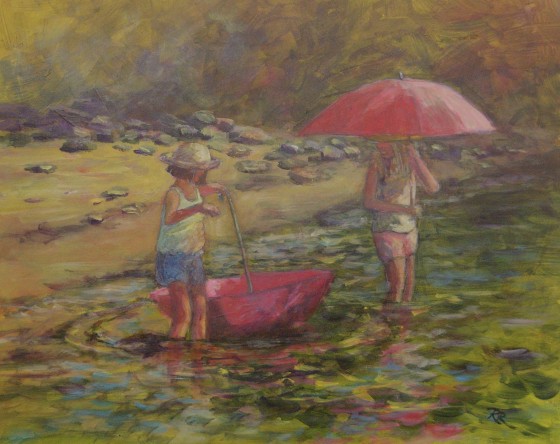
I reviewed the photos and selected several that I felt represented the girls' characters and the relationship between them best. One of the shots was a great pose for the older sister, but I liked a pose from a different photo for the younger sister. Happily, both shots were taken from the same angle, within seconds of each other, so I could combine the shots without worrying about a different perspective or light effect. I printed out both photos in black and white on regular printer paper (11 x 14), and then folded, cut,  and adjusted them to fit the selected parts together. Once I was happy with the fit, I sketched a thumbnail to finalize the value pattern and composition. The shots involved both girls holding umbrellas--but the older sister had her parasol over her shoulder while the younger one had creatively up-ended hers to spin it on the surface of the water. I liked this "bookending" design of the two umbrella domes, and positioned them to move the viewer's eye in a circular motion that enclosed both girls. While the girls' faces are indistinct, given the hats, the poses, and the size of the figures, their distinctive postures, expressions, and gestures identify them at once.

Next I gave consideration to the colour scheme of the painting. I wanted it to be light, sparkling, and suited to the youthful subjects  and summer atmosphere. The cove's shallow waters gave me lots of blues, greens, and yellows to play with, and the evergreen trees behind provided a pleasant mid-dark background to the scene. I adjusted the colours of the girls' clothing and the props to provide warm whites and pinks for a feminine and youthful but not saccharine effect.

Once I had transferred my basic composition to the hardboard (which had been cut to size and gessoed in white), I took quite a lot of time to draw the figures accurately on a separate piece of sketch paper, being especially attentive to their relative scale and size. Once I was fully satisfied with them, I transferred them as simplified outlines (using transfer paper) onto the painting board. I sealed the sketch with a thin wash of clear acrylic painting medium, and then toned the board with a warm midtone yellow to impart a feeling of sunlight underneath the whole scene. Next I washed in a few of the large dark areas to establish the composition, using a transparent dark green and some blues and purples, with splashes of orange and yellow to keep some sunlight in the background.

I tackled the figures next, thinking that I needed to ensure that they were going to be successful before spending a lot of time on the rest of the scene. Happily, both figures came together well right from the start, and I was able to maintain a nice transparency in the acrylic paint by limiting the number of layers. I maintained this technique as I moved to painting the water, enjoying the depth and sparkle that resulted from my use of various blues, greens, purples, and golds to depict the ripples surrounding the girls as they played, along with the broken reflections of the pink umbrellas. I completed the work with simple colour/value shapes for the beach, rocks, and background trees, keeping these suggestive only, to avoid competing with the figures that were the obvious subject of the work.

I let the work sit for a week or so, to ensure that I was truly happy with it, but apart from from very small adjustments, I left it alone to maintain its freshness and feeling of spontaneity. Although my patron intended to frame the work herself, I placed the piece into a suitable plein air frame just to show it to best effect when it was presented. My patron and her husband were well pleased with the result, but I had to help keep the finished work secret for some months until it was finally given as a Christmas gift, as planned.  Now that the family has received it (and, I am told, been thrilled by it), I can include it here.

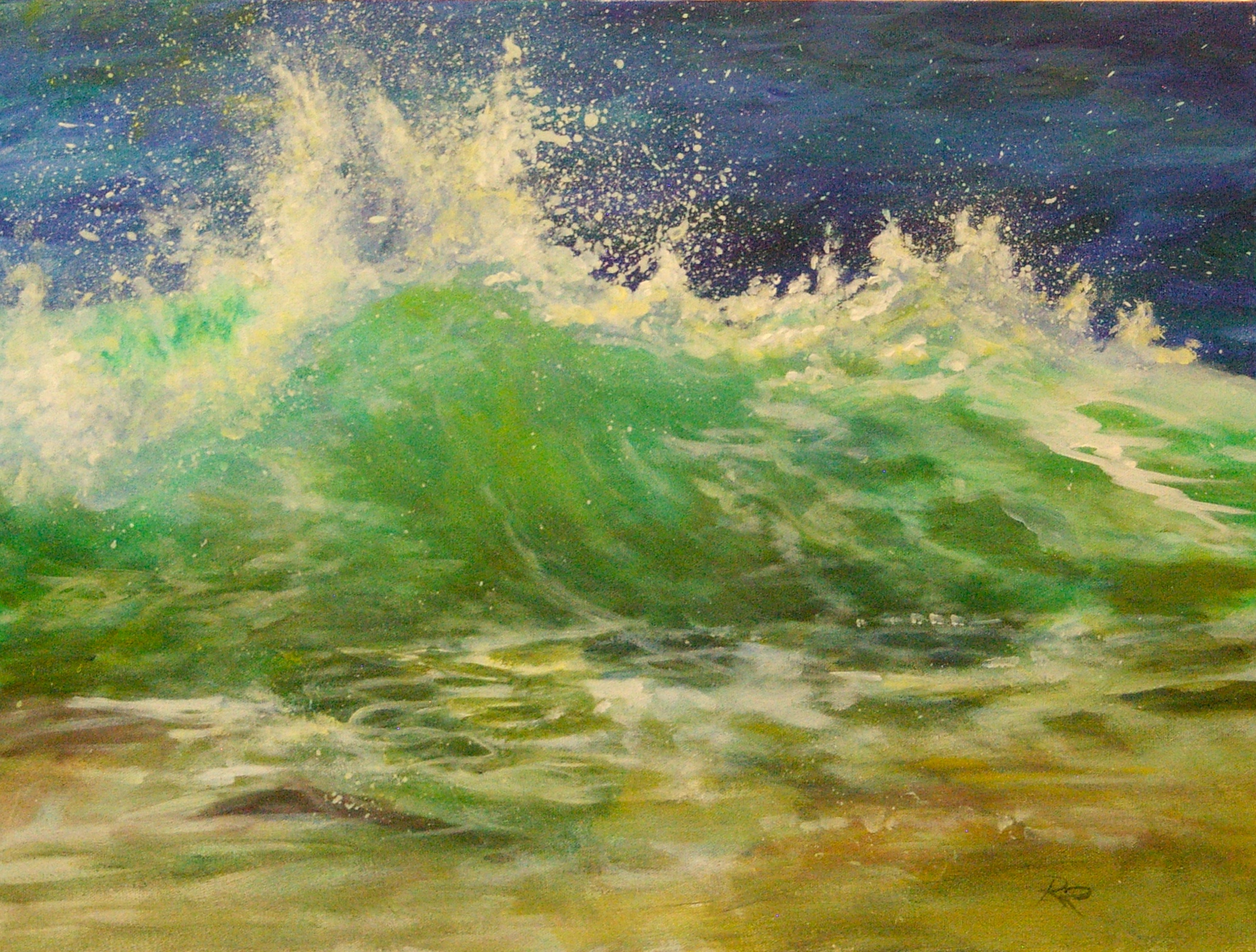
Here is the finished work, which I called Summer Circus (16 x 20)--but which my patron no doubt titles in her own mind with the names of her granddaughters! Completing this commission was a thoroughly enjoyable experience, and I hope to have the opportunity to do more of these figure portraits.


Summer Circus 16 x 20 acrylic Private Collection


Princesses Revisited

A selection of works from my Happily Ever After? collection (see gallery on this site) will be remounted in a feature exhibition at The Landing Gallery in Gibson's Landing, B.C. from Aug 2 through 29, 2014. This time, I am partnering with fellow artist Terri Whitaker, who will be exhibiting a collection of glass bead flower-inspired jewelry to complement the princess theme. The official opening will be on Saturday, August 9th between 1-4 p.m.. We are also planning a variety of follow-up events throughout the month to expand and explore the theme of the princess myth and its impact on the roles and expectations of girls and women. Check back here for details as they emerge! Was a Talking Frog More Valuable? Mixed Media $650 framed