Orange you glad it's not ALL green? (summer greens part 2)

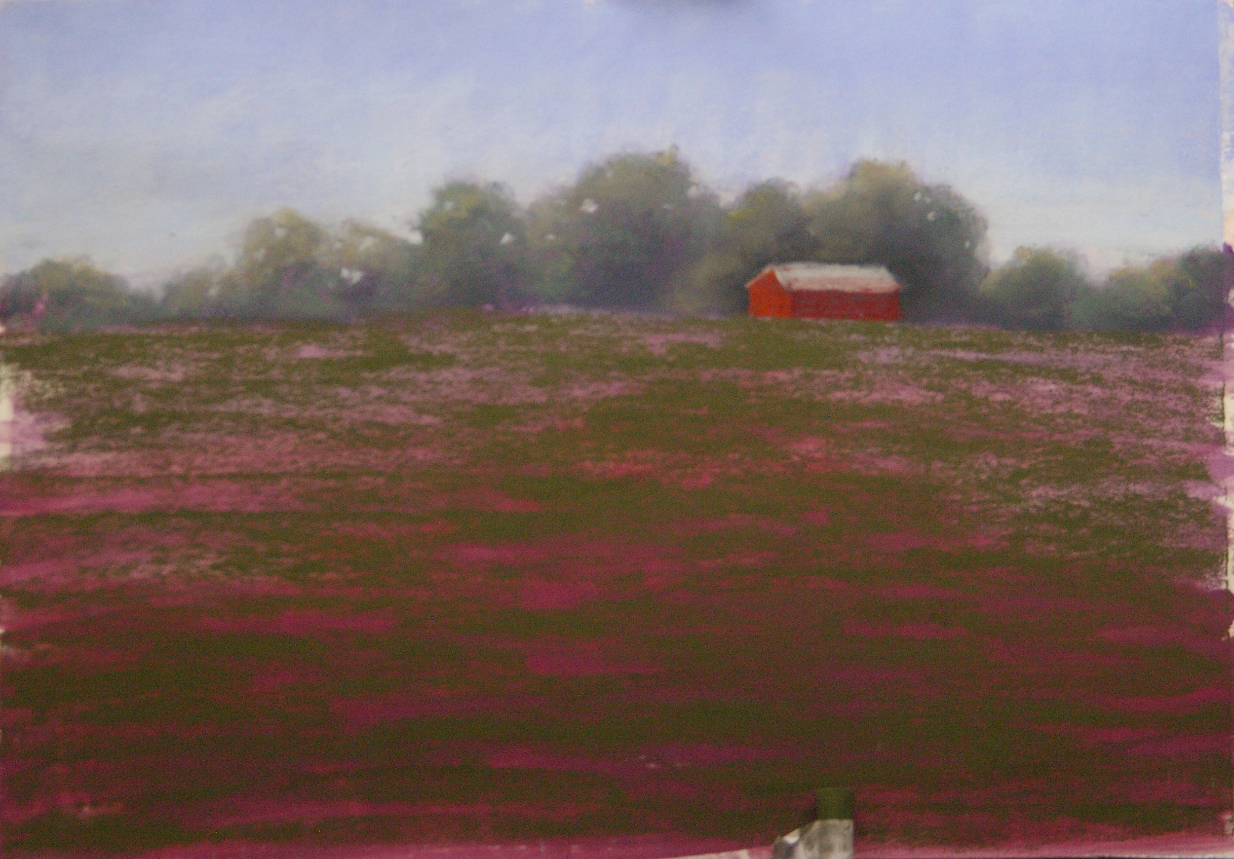
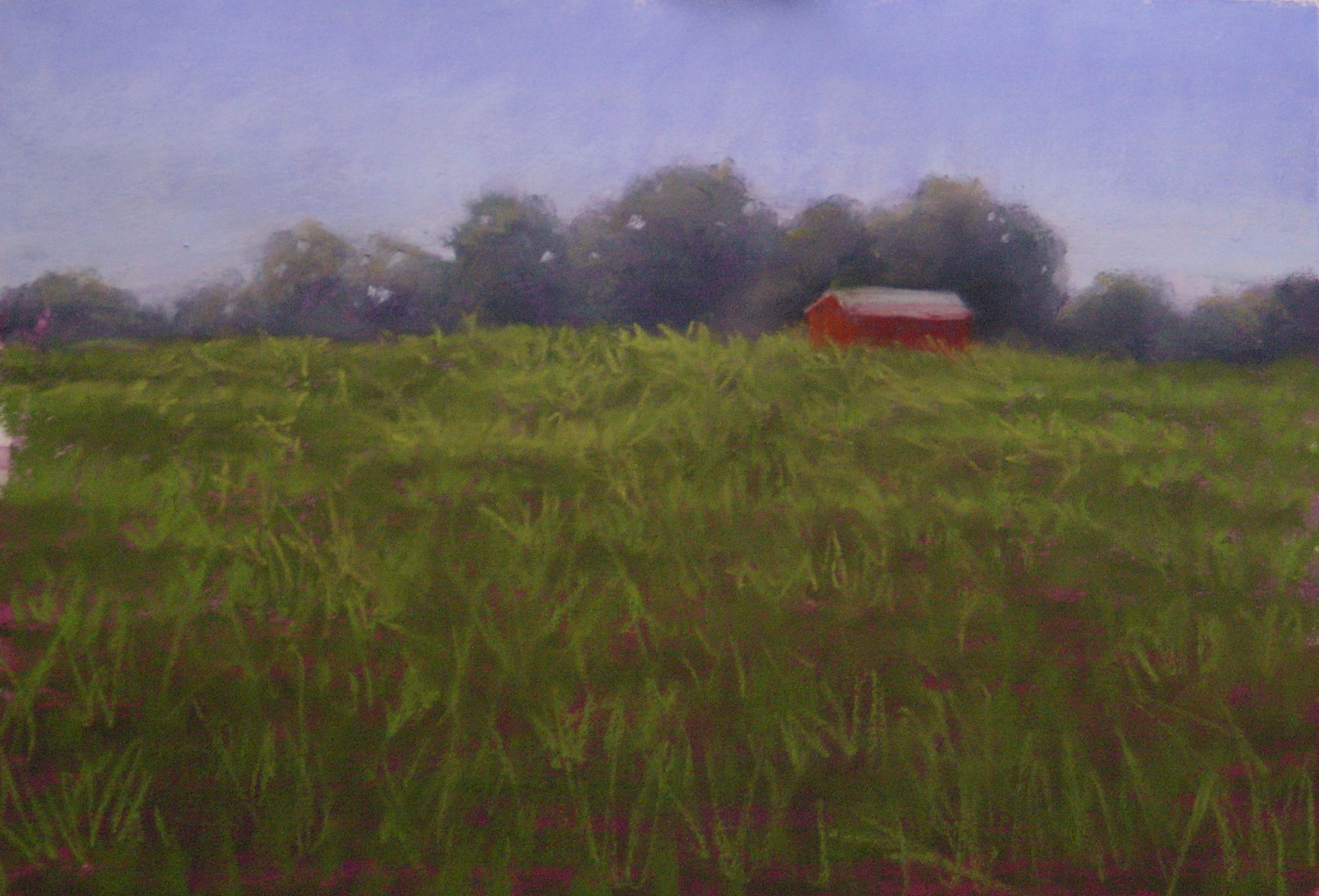
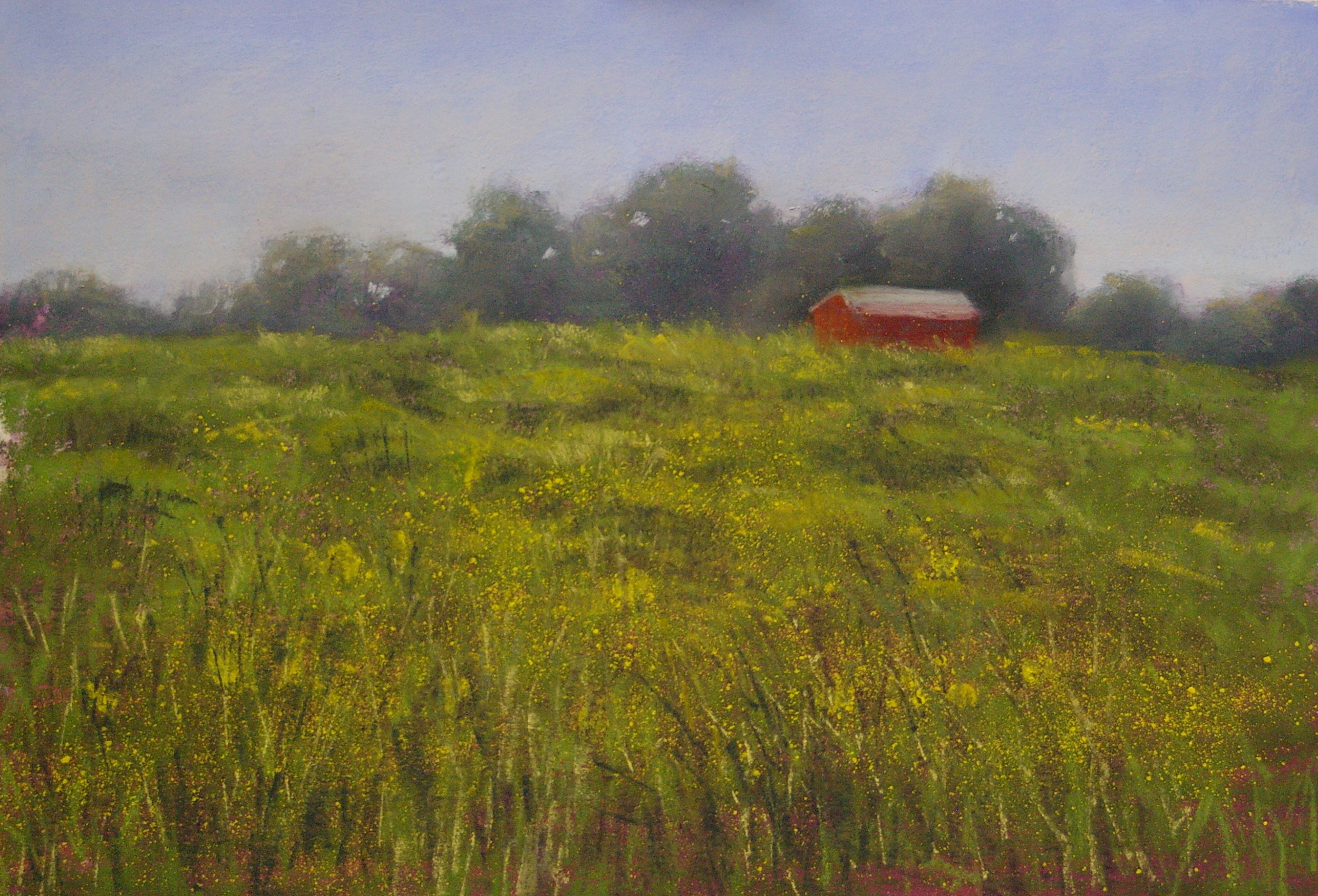
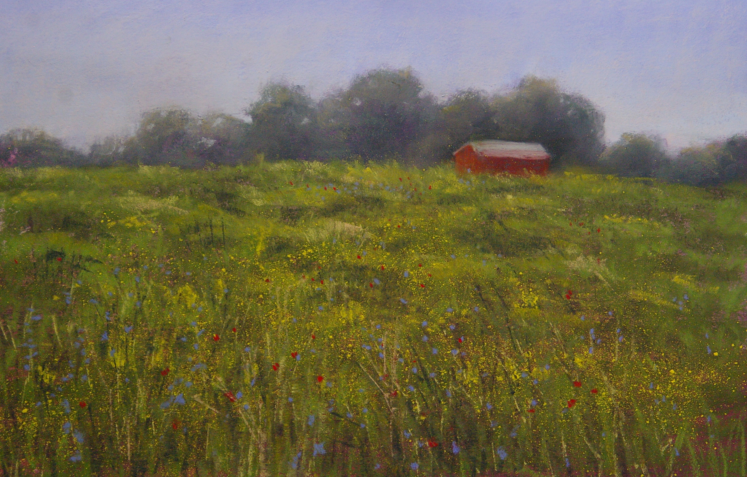
As the summer progresses, grasses start to take on a warmer tone, and late summer paintings benefit from underpaintings in orange and purple.  I recently completed this one, titled 'Til the Cows Come Home, by underpainting entirely with tones of orange (pale peach under the sky, pure orange under the grasses, and deep orange under the trees) and a red violet under the shadow areas.  You can still see the underpainting quite clearly in the detail shots, tying together all the varied greens in the scene.  


Summer Greens

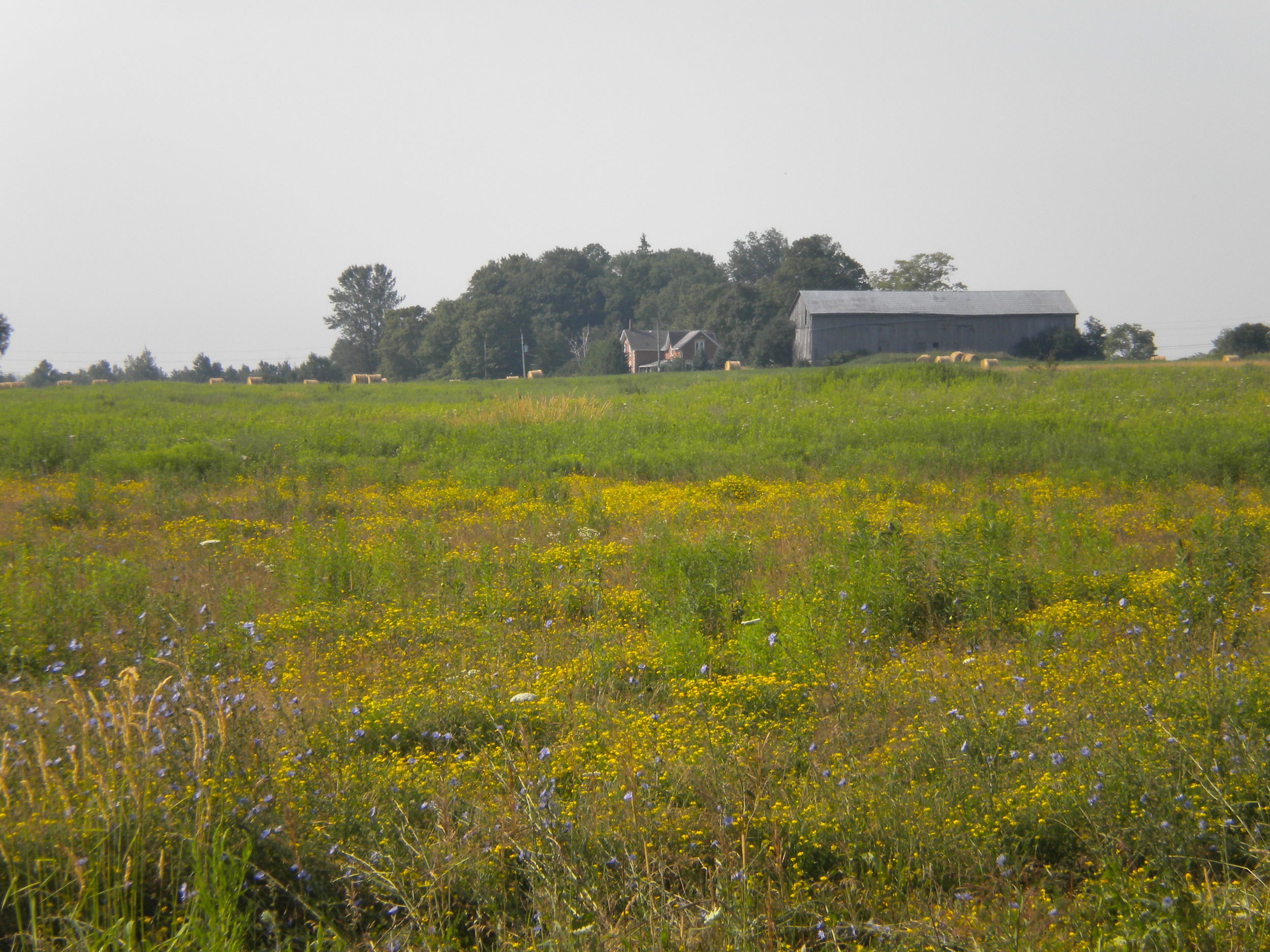
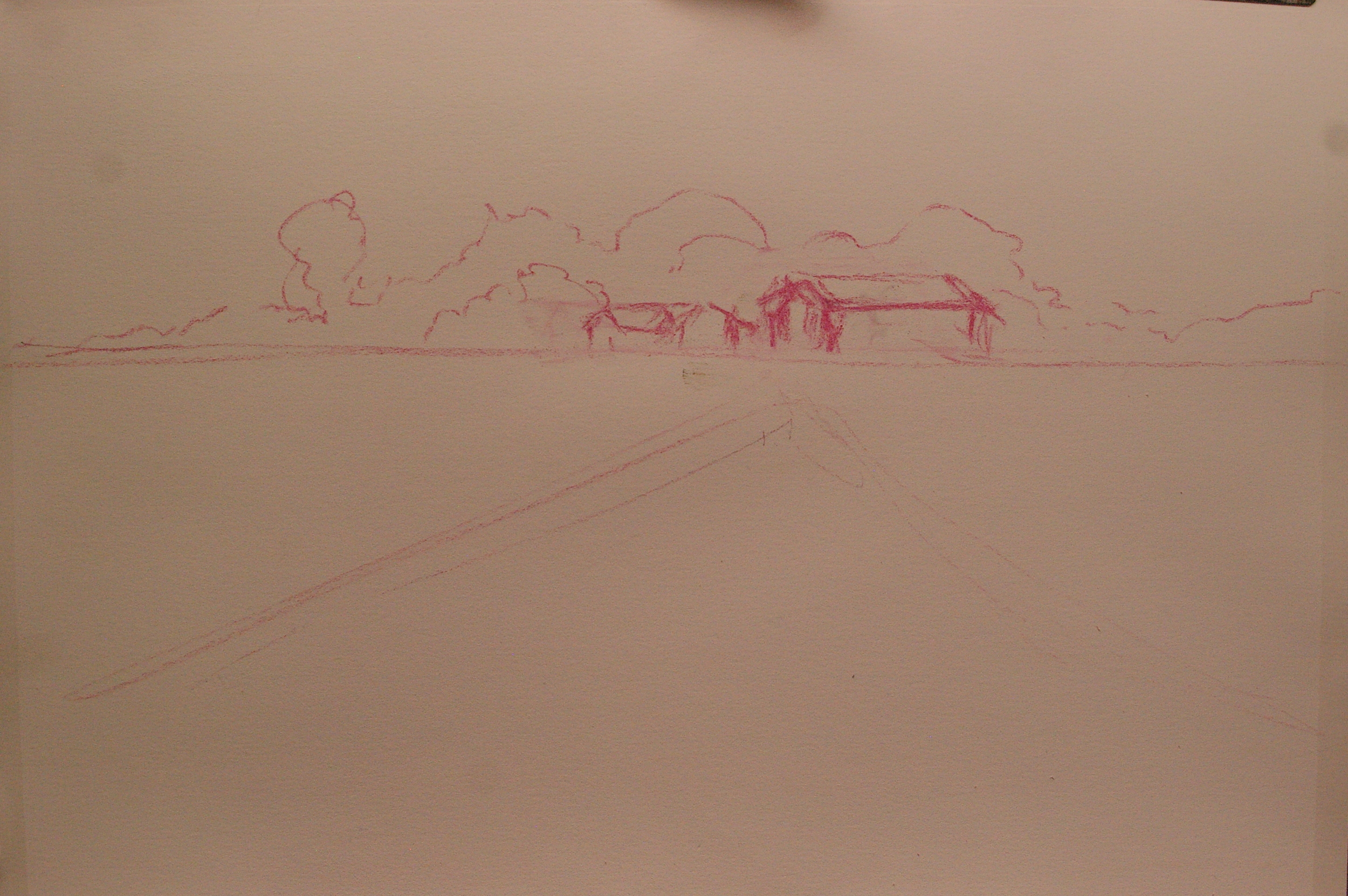
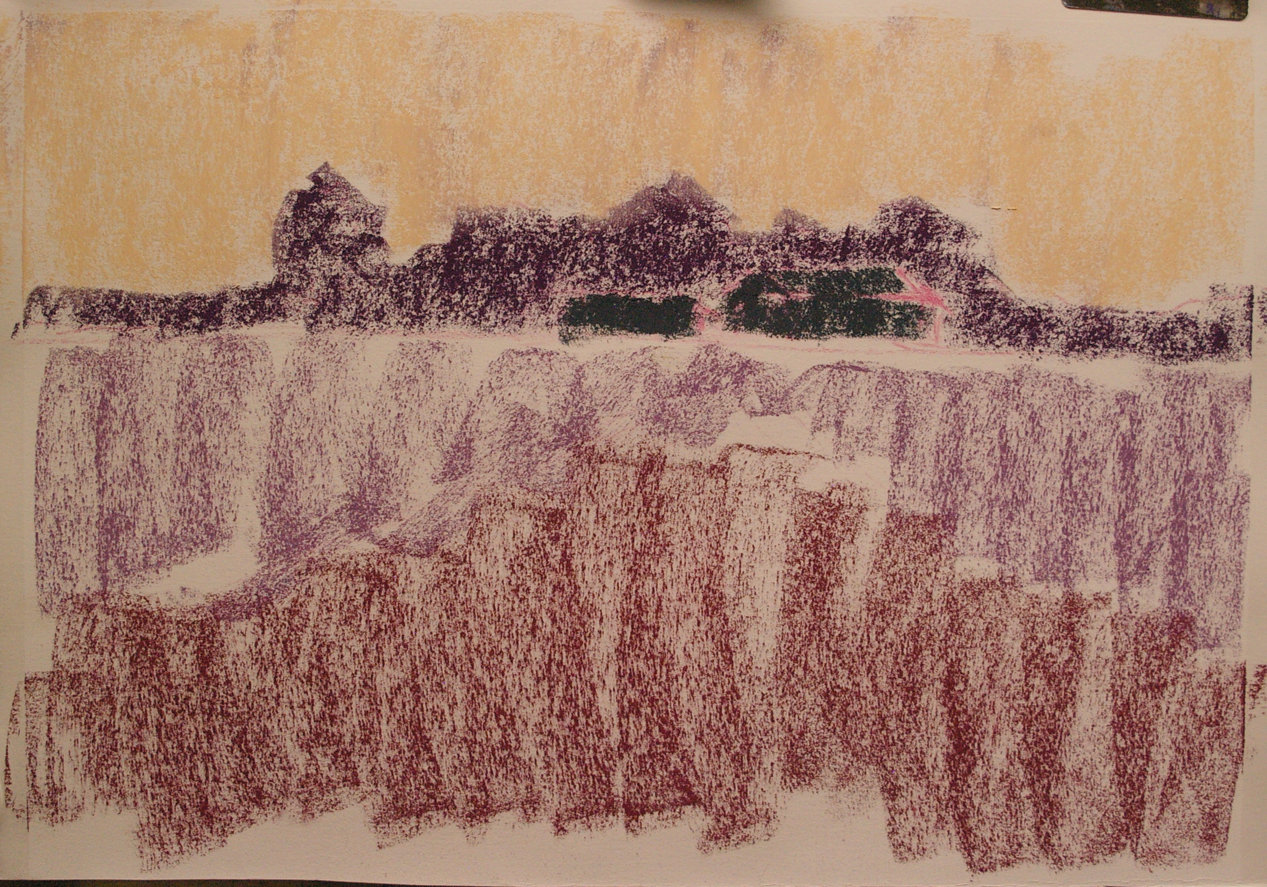
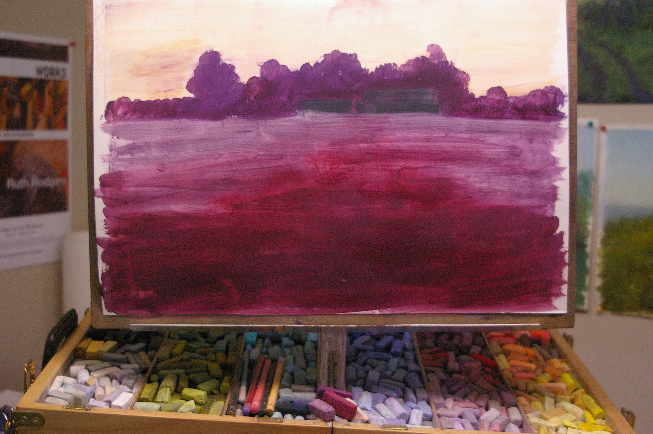
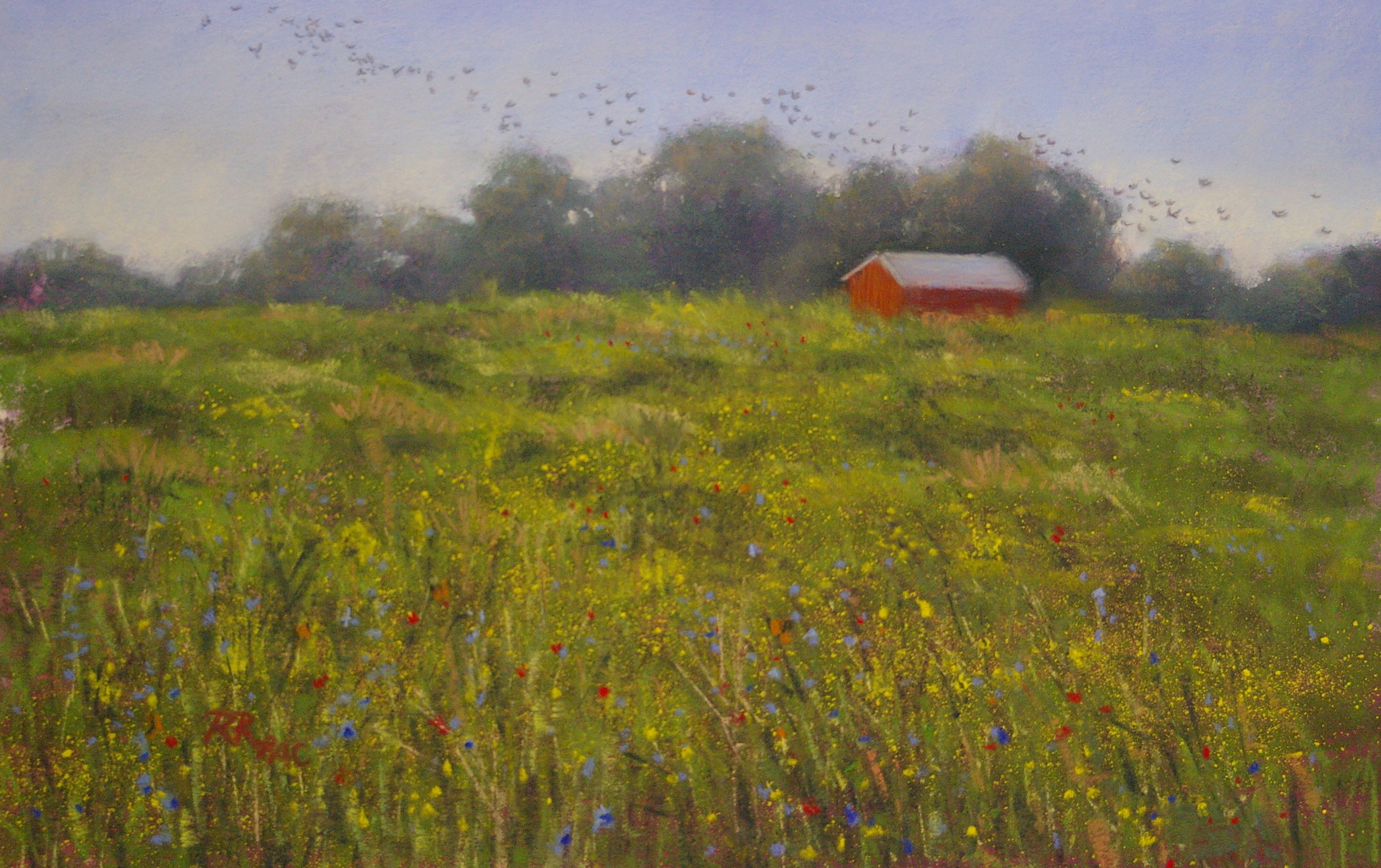
One of the toughest problems painters face in the summer months is the challenge of GREEN. Sometimes it seems as if the whole world is a sea of green, as in Paul Simon's song Kodachrome, "Give me the greens of summer; makes me think all the world's a sunny day." An upcoming lesson in my studio will (I hope) help students to tackle the challenges of "too much green" successfully.  Here are the steps in a demo that I've prepared to support the lesson, based on a photo taken of the summer field behind my friend Sandy's house.


For the scattered yellow flowers, I tried a new technique: I crushed a small amount of a vibrant yellow pastel into a dish, dissolved it in a bit of rubbing alcohol, then dipped an old toothbrush in and spattered the field.  Despite a few too-large drops, I was happy with the overall result, and once it dried it was easy to fix the areas I didn't like.  It looks more natural than hand-dotted flowers, I think.


The flock of starlings was inspired both by a flock that flew chattering by my studio as I was working, and my desire to have a balancing diagonal in the opposite direction to the main flow of the eye-path through the painting (essentially bottom left up to the barn in the upper right).  Using a dark gray pastel pencil, I started adding in the universal symbol for " flying bird": tiny v-shapes.  I kept adding, stepping back to check, adding more, smudging a few out...until I had a natural-looking flock.  I signed the piece in the bottom left (unusually for me), in red, to add another note of balance to the red barn, and named it Summer Flock.

M. Katherine Hurley workshop

Although I was suffering from an inner ear condition (labyrinthitis) that caused dizziness and fatigue, I was determined not to miss the chance to see Kay Hurley in action. Happily, the workshop was held in a private home where I was also staying, so I could slip off to my room for a rest as often as needed. Kay Hurley, from Cincinnati, Ohio, studied with famed pastelist Wolf Kahn, and is well known for her intensely coloured, abstracted landscapes.  I have admired her work for many years through magazine articles, and have been corresponding with her for over a year to arrange this workshop--and Kay did not disappoint. On the first day, she demonstrated a black & white "negative" painting accomplished through the use of only a black pastel and various erasers. I was familiar with this technique from her video, but it was wonderful to watch her do it "in the flesh."  Kay followed up with a full colour rendition of the same scene, just as beautiful.

On the second day, Kay had participants create a "jewelled ring", an exercise in exploring colour relationships.  Very useful and mind-expanding!

On the last afternoon, I felt well enough to complete a painting of the local golf course, as viewed out the studio windows through the enveloping fog. Kay's lessons on abstraction showed up in its simplicity, and her colour exercises helped me achieve a lovely glow. I look forward to studying with Kay again some day--especially when I am well enough to truly benefit!


For more on this workshop, see www.pastelartists.ca.


All Four Seasons in One Day

Like the variable spring weather we've been having, and the line from the Sting song, my students and I painted "all four seasons in one day" yesterday.  The lesson, designed to help us break free of over-reliance on photographs, required that we first do a value study from a photograph or a painting we'd already done, and then use a new seasonal palette to recreate the composition and value structure in a different colourway. One of students re-created a summer scene as a fresh and vibrant spring scene, and another made an even more dramatic shift from a summer scene to a snowy winter scene! By following the basic composition and value structure, but replacing the colours, a new painting was possible without a new reference.  When pursuing this exercise to its fullest and painting all four seasons, it's also interesting to vary the composition somewhat, by zooming in or cropping the original photo reference, or changing the format (from rectangular to square, for example) for a new painting.

Most importantly, moving away from the reference photo builds skills in terms of colour selection, value patterns, and drawing upon memory and observation of the natural world for your painting.  All of these make for more original, more creative work, which is often more "painterly" and interpretive than your first work from a photo might be.


I've mislaid the original photo, but my first painting (done several years ago) was this one, The Little Grove in Summer (9 x 12").  Below are three new interpretations of the same scene.


(Shower of Gold, 8.5 x 11")

(Winter Coat 8.5 x 11")

(Easter Grass 9 x 12")

Mini Me

In a recent conversation with my pastel students, I learned that one of them particularly loved a painting of mine that is in my own collection. Many artists keep a personal collection of works.  For me, these are the ones that fall into one or more of the following categories: 1) I painted it under the supervision of another artist in a course or workshop, and it is therefore ineligible to be shown in juried shows;

2) it represents a breakthrough in technique or approach for me, and I want to keep a memento of the lesson learned;

3) it is of a scene that has a significance to me (such as the small stream that crosses a corner of a road near my former house--when I reached that spot, I knew I was almost home);

4) I simply love it too much to part with it--or someone in my family does!

Buttercup Meadow (19" x 18.5"), pictured below, represents a breakthrough for me in the painting of various shades of green.  Recalling Richard McKinley's admonition that "purple is green's friend", I underpainted the whole scene in various values of purple, both blue purples and intense red-violets.  The resulting underpainting was pretty bright and a bit scary, but I gulped and started applying the many greens in this scene of spring by a meandering stream.  I was delighted to find that, indeed, the purples provided a great foundation for the various greens, giving them weight and variety. I allowed quite a bit of them to show through the scumbled greens, and in the forground grassy area, they gave the impression of textured foliage and perhaps tiny flowers--exactly the effect I was seeking. I was very pleased with the resulting painting, and when my husband (my best critic and fan) said it was the best work I'd done so far, I knew it was a keeper. Buttercup Meadow, obviously, fits into category 2 above, and it's unlikely I'll ever sell it.

When I heard that my student particularly liked this scene, however, I wondered if I could perhaps approach the scene again, but in a different format.  The result, Spring by the Stream (13" x 13") is the result. The new painting is much smaller than the original, has a slightly different composition, and includes brighter and more flowers in the meadow. However, I painted it in the same way (with a purple underpainting), and I think it is equally successful.  I'm not sure I'd make a habit of this--it's perhaps not a great idea to repeat myself and have many iterations of the same work--but in this instance, with an original work I don't intend to sell, and a person who really wanted one like it, I decided it would be ok to try it out. An interesting experience!