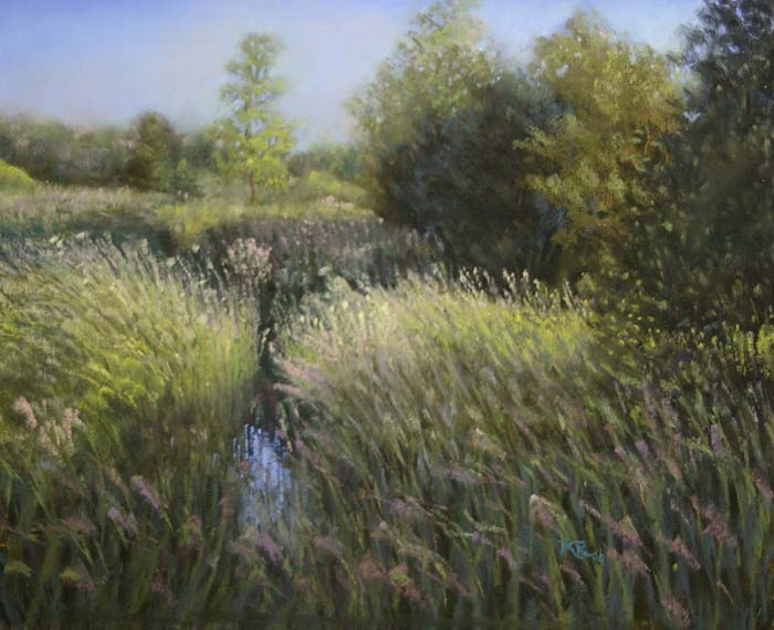
This May for the first time I splurged and traveled to Albuquerque New Mexico for the biannual International Association of Pastel Societies (IAPS) convention. It's THE place to be for a pastel artist. Not only did I attend demos by long-admired pastel artists (including Liz Heywood-Sullivan, Les DeMille, Sean Dye and Jimmy Wright), I got to re-connect with buddies from former workshops with Elizabeth Mowry and Richard McKinley. It was a feast of learning and fun--but one of the best parts was the trade show, at which suppliers of pastel materials showcased their wares and offered them at significantly reduced prices--sweet! I succumbed to temptation (pastels get used up and have to be replaced, after all!) and purchased a whole gorgeous set of Great American Art Works pastels, in a colour selection by Richard McKinley. Because I have studied with Richard and know that his style and subject matter are similar to my own, I knew that this colour selection would work for me. GAA pastels are very soft (a bit softer than Unisons) but have a square shape, which enables you to create linear effects by tapping the edge instead of drawing a line--see this technique used in this recent piece (from a photo taken on a recent trip to Salt Spring island--a fabulous place for artists!). This set has become my base set now, and I only supplement when needed from other brands--I love these pastels!!
The biggest buzz at the trade show, however, was around the Terry Ludwig booth. Terry's pastels are also square, but are a little bit harder and grittier than the GAAs. His claim to fame, however, is the intensity of his hues, especially in dark values. The pastels were all laid out like candies in a huge spread, the prices were discounted, and the salespeople handed you a box to fill--irrisistible! Having never tried the Ludwigs, I limited my exploration to 16 in a variety of values and colours. I'm not a draw-entering kinda person (as a result, I don't tend to win anything much) but entry into the door prize draw was automatic with a purchase, so much to my surprise and delight, I won a free set of 60 Ludwig pastels moments before leaving the show for the airport! I quickly chose a set of 30 cool greens, and a set of 30 intense darks, which arrived by mail several weeks later. Both of these sets have been proving invaluable as I work on green-heavy summer scenes.
There seem to be two tricks to handling all the greens in a summer scene in pastels:
1) Vary the greens, using warms and cools (mossy golden greens, intense grassy greens, cool silvery greens) and various values (light citrus greens through deep evergreens) to differentiate your trees, shrubs, and grasses, and use them intentionally to create depth in the picture plane (in general, warm and dark brings things forward, cool and light sends things back). See that working in this painting? I really put those Ludwig cool greens to work here.
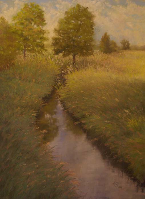
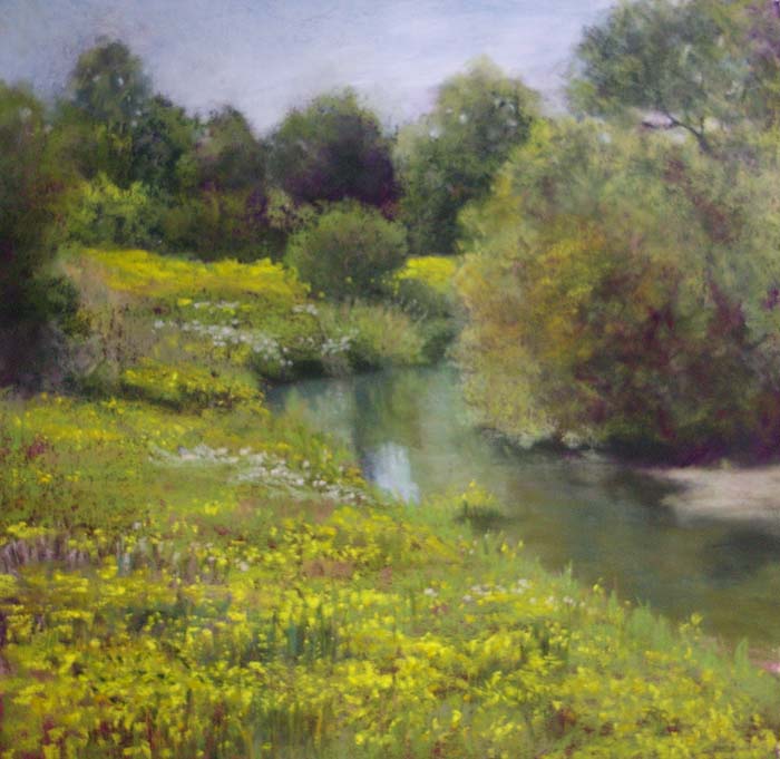
2) Start WAY darker than you intend to finish, when doing your underpainting. In the first painting below, I was experimenting with a watercolour underpainting--a medium in which it is tough to get intense darks (at least for me, a novice to the medium). While the resulting painting is pleasant, it has a very soft, humid, gentle feel to it (and it was a long slog to get there, too...). In contrast, the second painting below was underpainted using the Ludwig intense darks in various shades of blue-purple and red-violet (those being the complements of the eventual yellow-greens). See how much more snap and sparkle this work has? And it was WAY easier to get there. Lesson learned!


